Arbox logo, on the left - 4 screens from the design with green background

About

About

Arbox is all-in-one business management software for small businesses, mainly focused on the health & fitness industry.
The gym I'm going to is using their services and after hearing some complaints from people in the gym, I wanted to explore features that can further improve user engagement and experience within the app.


Role: UX/UI Designer

Main Challenge

Main Challenge

Make users spend more time in the app.

Method - Design Thinking

Method - Design Thinking

Empathize

Empathize

Empathize

Define

Define

Define

Ideate

Ideate

Ideate

Prototype

Prototype

Prototype

Test

Test

Test

Research

Research

For my research I interviewed users via Google Forms.
Here are some of the questions and findings:

Ideas & Decision

Ideas & Decision

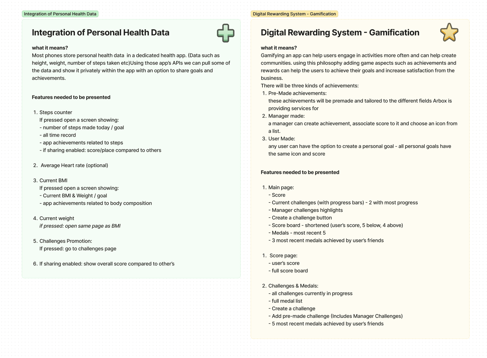
I came up with a few Ideas and chose:

  1. Integration of personal health data from other health apps.

  2. Digital rewards system.

colored sections in a fig.jam file that describes the ideas for the new features

User Flows

User Flows

To better understand what screen should be built, I created a user flow that maps each feature

Wireframing

I created wireframes to give an idea of the layouts

wirefames sketched by hand

Design / Feed

Design / Feed

The new feed page offers a clear overview of the user's health data, score, future schedule and an option to schedule a new session quickly.,

Old design vs new design

Design / Score System

Design / Score System

To 'gamify' the app a score system was added.
There are three types of challenges:

  1. General Challenge - a pre-made challenge.

  2. Business Challenge - Created by the business owner to fit specific business needs.

  3. User Made Challenge.

score system screens

Retrospect

Retrospect

This project was a fun project to work on. It taught me a lot about how to properly do UX work with no stress, and how to organize a project. There are many more improvements to be made such as Rewards and Medals to show other friends. A social feed to share news and achievements and many more features.

© Johnathan Hollins, 2023